• Photography
  • Interviews
  • Business
  • Reviews

Tiffinbox

Inspiring Photographers

  • Home
  • About
  • Blog
  • Contact

4 Useful Tips For Designing Wedding Albums

November 17, 2011 by Kate Anderson

Today's guest post is by Kate Anderson of Plumeria Album Design. Kate works with professional photographers to design clean, classic albums that wow their clients while giving the photographer some much needed free time. She lives in Minneapolis, MN. Follow her on Twitter.

Imagine a scene with me for a moment. It's 25 years or so in the future (cue the Back to the Future music now); a woman is looking through boxes in her closet. She's a bit upset, her son's new fiance is looking on. Finally, the woman finds what she's looking for. It's an old iPad, an antique from 2011. The woman looks at it with a loving smile.

“These are my wedding photos from when we were married. I haven't looked at this in so many years.”

Then the smile fades. The woman realizes there is a problem. The battery is long drained from disuse, and the charging cable is no where to be found. They've moved several times since the wedding, and as usually happens, things got misplaced and lost. Amazingly, there is a dvd, with a beautiful photo of wedding rings on it. The backup copy of the photos. But with no dvd drive in her possession for a decade, the woman can't even look at those. Her wedding photos are locked away in a digital purgatory. She can't show her future daughter in law her own wedding.

If you don't offer albums to your couples, this is a very likely scenario in the future. They probably have all the best intentions to print an album, probably at Blurb or Snapfish. But for many, it will get pushed to the back burner and neglected. So it's up to you, their trusted wedding photographer, to make sure they get an album, before it's too late. Printed books never become obselete, technology does. You don't want your brides and grooms to live on their harddrive forever.

But many photographers don't offer albums, for many of the same reasons that their clients won't get around to printing one themselves after they receive their shoot and burn disk. Albums take time if they're to be done well. They have to be put together with a storyteller's eyes. The right photos have to be selected, from hundreds. However, album design doesn't always have to be a panic inducing moment. Here's a few design tips and my process, to help you out.

Don't cram the album with photos

Less is more. Remember that. I like to have only a few photos per page for most spreads, usually around 2-3 per page. This lets each photo have it's own voice. Too many photos crammed on one page gives you a sense of confusion. Your eye darts around the page quickly, rather than calmly resting on each photo for a moment and moving on to the next. Too many photos fighting for your attention all at the same time means none get the attention they deserve, and the message that the photos tell gets lost. Look at a National Geographic magazine, or fine art book; then look at a tabloid magazine. Which feels calmer to your eye? Ignore the content of the tabloid vs the National Geographic.

Designing Wedding Albums - Plumeria Album Design

But with all guidelines, there are exceptions. Some spreads work better with a bit of a denser layout. Spreads of the family groupings and wedding party, or spreads of reception dancing are examples. With family groupings, having several photos per page gives the sense of family continuity. Everyone is together, and the photos are likely to be very similar in composition. That consistency is calming to the eye even when there's many of them. Reception and dancing spreads a bit of the opposite to me. I usually want those to give a sense of energy and excitement. Using a denser layout gives that feeling.

Designing Wedding Albums - Plumeria Album Design

Spreads meant to show action also may get a few more photos per page; the story of the first look can't always be told in a few photos. Spreads that focus on a scene, such as the ceremony site, sometimes need a denser layout also, to show the whole scene in one spread, as if the viewer were there and could walk around to look at different things.

Designing Wedding Albums - Plumeria Album Design

Don't be afraid of the dark/white space

White space is a good thing. It focuses the eye on the photo and eliminates distractions. Think about iconic, high end brands, such as Chanel, Apple or Tiffany's. Their websites and print materials have one thing in common. White space, or negative space. Then think about lower end brands. Their websites and print materials have lots of stuff, everywhere. It's distracting and cheapens the feel.

Also, it's a lot easier to design with white space than to try and fill the page with photos. It's like putting together a puzzle. If you're not afraid of the white space, you can use only the photos that are perfect for the spread, rather than having to add or subract photos to make everything fit. In this spread, having any other photos would have been distracting and taken away from the focus.

Designing Wedding Albums - Plumeria Album Design

Don't fluff up the album

Remember that “less is more” bit? That applies to how long the album is. An album is perfect when nothing can be removed without losing part of the story, and nothing can be added without feeling repetitive. Each spread should have it's own theme, or portray one event. While there may be dozens of great photos of the couple after the wedding in a field, the album doesn't necessarily need all of those photos in several spreads. Pick the best 3 or 4 and create one spread that showcases the best parts of the session. This scene had lots of awesome shots, and I could have easily used several more, it was hard to choose only a few. But adding more would have taken away from the simplicity of the moment.

Designing Wedding Albums - Plumeria Album Design

Do keep it timeless

Wedding albums should be timeless. Simple and clean design is the only “trend” that stands the test of time. Think of the simple black dress, or the basic charcoal gray suit. Those work now, they worked 50 years ago, and they'll probably work 50 years from now. They are simple and clean clothing items. Your album should be the simple black dress. Extra graphics, photo layering, fading, and spot coloring may look cool now, but how are they going to look on the couple's 50th wedding anniversary to their grandkids? Don't give the kids anything more to snicker at besides the clothing and decor trends.

The 5-Step Design Process

Here's what works for me.

1) The first step for me is to download the photos and set up the folders for each album in a client's folder. Here's what my layout looks like:

Designing Wedding Albums - Plumeria Album Design

2) I sort through the photos and make copies of the album selections. Each spread gets it's own folder with a theme/title, and the copied album selections are dropped in. I tag selections in red in Bridge so I don't duplicate, and the main photos of each spread get a star rating.

3) I use InDesign with the AlbumFlow script to design albums. You can also use Photoshop, and I've heard only good things about Fundy's Album Builder [aff] to speed things up. The debate of InDesign vs Photoshop is for another discussion. It's similar to Ford vs Chevy, Canon vs Nikon; they all get the job done in the end, one way or another.

4) Now I go through the finished design to eliminate any problems. I make sure the bleeds and margins are correct, that full bleed photos will be just that, and that all other photos are within the safety zone. I make sure all the photos line up and spacing is consistent. I double check that no one's head or an important detail is going to get trimmed off.

5) Last, the finished design is exported as a PDF using guidelines from AlbumFlow, to create the highest quality print. I then use Photoshop to create JPEGs from the PDF using ImageBrander from FundySOS [aff]. It's a super helpful plugin for easily watermarking and creating multiple sizes and resolutions. I can make full size JPEGs for the album company and smaller ones for the blog, all in one shot.

This isn't the first time we have addressed album design on Tiffinbox. Justine Ungaro talked about it in this post. My question for you is this – are you still stressing out about your album designs? Or, are you blissfully adding images to your pages willy-nilly and hoping that your clients don't notice. Trust me, clients are getting savvier and do know good design from bad. So, what are you going to do? You can hone your skills (if you have time) or you can farm the task out. What would you do? Tell me/us down below. It's not an easy decision. I do know that.

Filed Under: Art & Design, Photography Tagged With: adobe creative suite, adobe indesign, adobe photoshop, Album, album designs, application software, Design, design elements, design tips, designing, graphic design, kate anderson, Photographers, portrait albums, Portraits, proprietary software, steps design process, Tips, Wedding, wedding album, wedding album design, wedding albums, wedding photo, wedding rings, Weddings, white space

Are You Really A Professional Photographer?

November 16, 2011 by Andy Bondurant

Some of you may recall Andy Bondurant's steamy blog post from almost a year ago called “What's Too Sexy For High School Seniors?“. Well he is back, with more advice for photographers. He is the co-founder and director of Senior Portrait Artists. You can find him on Twitter and Facebook.

I recently ran across a question on the question/answer/information site Quora. Here was the question, “How can I dress like a professional photographer?”

I can hear some of the responses some of you have come up with already. “Great, another amateur, jumping into photography taking more of my clients.” But wait just a minute more, because what I found truly disturbing was the first response.

You can visit the site for the full response, but here is the first line:

“This is an awesome question. In my experience shooting events, it's less important how you dress and more important how your equipment looks.”

What?

The right equipment for the right job can make a huge difference in getting the shot you want and need. By no means does it make you a professional. In fact, it may put you out of business quicker than anything else you could do. Professional equipment is expensive, and much of it is not necessary to begin a business.

Over the past 8-10 years, I've had the blessing of having multiple opportunities each year to watch great, professional portrait photographers work on location shoots. Most of the time they have exactly what they need, when they need it. However,many times I would hear things like, “Oh, I wish I had …” Then they move on to get a great shot without the piece of equipment they just mentioned.

So what is that makes GREAT photographers GREAT? It's not the equipment, and it goes beyond just training. Here are 3 qualities I've found seems to be similar among photographers who are professional.

1. Relationship.

The best photographers seem to be able to connect with their clients quickly and efficiently. If you want to get images that truly portray a subject's personality you need that person to trust you. You need them to believe you are going to make them look incredible.

If the client doesn't trust you it shows in their eyes. It shows in their body posture.

Personality is not necessarily the biggest factor in this either. Having a fun, outgoing personality helps, but I've seen more reserved photographers do just as well as larger than life photographers.

The key to building relationship is caring. Building trust means truly and genuinely caring for the client and how they look and feel.

2. Time.

Above, I mentioned greatness is more than equipment or training. Having the right equipment and training only take you so far. Having the right equipment without enough time using it will result in sub-par images. Having the correct training without time to practice and perfect that training will lead to a less than perfect product.

Malcolm Gladwell in his book Outliers calls this the 10,000 hour rule. His premise is anyone who excels in their field has spent 10,000+ hours perfecting it before they become “known” for their skill. He references The Beatles, Bill Gates and others who fit this theory.

There is no substitute for time in photography. The more time you spend shooting, editing and perfecting, the better photographer you will be.

3. Consistency.

John Pyle wrote an article for The Collective arguing that this one point is what truly makes a professional photographer professional.

The ability to get a great shot no matter the circumstances, time of day, or the not having the “right” equipment is what sets the pro apart from the amateur.

Consistency is directly related to #2. The more time you have doing photography the more consistent product you will create.

Let me wrap up by telling you one more thing.

I'm not a photographer. Before you completely forget what I've written based on that statement, think about this: Each one of the above points (relationship, time, consistency) applies to any profession.

I don't care if you are a doctor, lawyer, lock-smith, banker or pizza maker all 3 of these qualities will be found in the great ones. It will have nothing to do with the equipment they do or don't have.

It will be about creating relationships, having time invested in their profession, and consistently giving great service and/or creating a great product.

What do you think? Is Andy right on the money about this? Discuss below!

Filed Under: Business, Photography Tagged With: andy bondurant, consistency, factors, photographer, Photography, professional, professional equipment, professional photographer, professional photographers, professional portrait photographer, relationship, senior portraits, visual arts, visual journalism, Wedding Photography

Delicious Dereliction, An Exploration Of Urban Decay Through Photography

November 15, 2011 by David Wares

This guest post is by David Wares. He is Based in the South East of England UK. He loves to photograph nature, landscape and over the last couple of years has become fascinated with the subject of Urban Exploration and dereliction. This year, he says,”I was lucky enough to win ‘The Portman Cup' for Best Image of 2010 at the Sussex Photographic Federation's Digital Projected Image competition.” He also writes the ‘Scenic Outlook' column for Current Photographer. Follow him on Twitter.

There’s something about places and objects that have fallen into disrepair that really intrigue me. I’m no historian by any means but I’ve always had an interest in visiting old ruins, such as the many medieval castles found across the UK. I can’t say exactly what it is that I find so fascinating; sometimes it starts me thinking about what may have gone on and sometimes it is merely the look of these old ruins. Again, it is hard to explain why something that is old and broken may be aesthetically pleasing, all I know is that it is.

So how does this all relate to me and my photography? When I started out I took the route that many others take, that of landscape photography. Quite often I love to visit the very picturesque Bodiam Castle, a classic castle ruin that is very well preserved and has an air of mystery about it during the early morning when shrouded by mist. It wasn’t until about three years ago that my interest in dereliction would take a new direction; Urban Exploration.

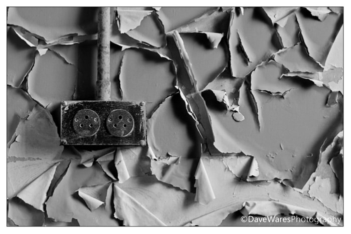
Urban Decay by David Wares

Urban Decay by David Wares

Far from the picturesque ruins I and most others are familiar with, Urban Exploration (or UrBex) involves going into more modern places that have been abandoned and become derelict for various different reasons. These tend to include old factories, hospitals, gas stations, fair grounds, manor houses and mansions; the list goes on and on. The term Urban Exploration itself is a bit vague but usually refers to people that frequent said abandoned buildings and tunnels (usually dangerous and off limits), however it could also be applied to places that the general public just don’t go to all that much, such as a junk yard or back alley for instance. Sometimes I take a trip down to our local beach where a small fishing fleet resides; you can find all sorts of rotten and rusty old worn out objects there.

Urban Decay by David Wares

Urban Decay by David Wares

The theme of dereliction will often result in your pictures having a much more sombre look and feel which in itself can be a really interesting avenue to explore. Not all pictures have to be bright and colourful. :)

Urban Decay by David Wares

Urban Decay by David Wares

I’m by no means advocating that everyone go out and start trespassing; that is something you need to take very careful consideration over, for both health and legal reasons. However, I do encourage everyone take the time to look in places that others avoid as there are so many artefacts that you can find and in the most accessible of areas that can and will make wonderful and interesting subjects for your pictures. Another great thing about dereliction is that in my view it’s an all weather activity. Whereas some other genres of photography can benefit from the ‘right’ kind of light, dereliction seems to lend itself to almost any lighting situation you can think of. Sunlight can bring out colours in rust etc while overcast or dull light can give bring an eerie or solemn feel to your pictures.

Urban Decay by David Wares

Have you explored your neighborhood? Does Urban Exploration intrigue you? Can you give yourself an assignment to photograph a place that has been abandoned in your neck of the woods? Come back here and share your images.

Filed Under: Photography Tagged With: david, dereliction, England, exploration, landscape photography, medieval castles, Photography, Sussex, urban decay, urban exploration, wares

A Review Of Acrylic Print Panels From Pictage

October 24, 2011 by Seshu | Editor & Publisher

Let me start with two very public disclosures – 1) I received a 24×36 Acrylic print of one of my own images from Pictage to help in this review and 2) I simply love it.

Here is the image I submitted to Pictage (I shot this at The Westin Boston Waterfront, when I worked with Nabil Kapasi):

Indian Wedding At The Westin In Boston

I am sure you are wondering why I feel so passionately about this one product. I recall hearing a photographer at Mystic Seminars say that if you want to stand out in the crowd, you've got to offer unique products to your clients. Well, let me tell you, these Acrylic prints will definitely be something I offer to my clients moving forward because the sample I received is STUNNING.

The combination of extremely clear and flawless elements and ultra smooth (transparent) finish sets these materials apart from more common Acrylic materials. The material, I am told, is extremely hard and is therefore difficult to scratch. (but not impossible). The edges are flame polished (melted if you will), to a smooth, safe, finish. It may take some knocks but why experiment, eh?

From Pictage's CEO, Jim Collins:

“The print affixed to the acrylic panel is not a silver halide photographic print. It is a giclee’ print quite similar to a fine art print. (just on different paper). As you are probably already aware, this process yields a print that carries intense colors, blacks and contrasts and this is responsible for some of the increase in detail that you can see in the print.

The acrylic serves two purposes. I guess you could say it’s not just a pretty face. The first purpose is obvious. Sex appeal. This is a very cool way to package a keepsake.  The second purpose may also be obvious to photographers, but I’m finding that this isn’t necessarily the case. In much the same fashion as a glass globe intensifies the output of a candle the acrylic actually intensifies the brightness of the print. The clear surface gathers light. This is one of the reasons why you really can’t take your eyes off of your new acrylic. That effect almost makes you want to study every detail in greater degrees.”  

Pictage Acrylic Panel Sample - Indian Wedding At The Westin Boston Waterfront

No doubt this is a premium product and it comes at what I would consider a very respectable wholesale starting price that Pictage has brokered for wedding and portrait photographers.

Acrylic pricing for photographers starts at $84.50 for a 12X18 (the smallest available size), and climbs to about $750 for a 40X60. Interestingly, due to the giclee’ process, images can be printed at significantly larger sizes than traditional photographic prints, so stunning clarity even at Wall Covering size is possible. This will be evident in the two 40X60 panels Pictage will have on display at PartnerCon. Square and panorama formats will also available.

Photographers interested in these Acrylic prints will have to become a member of Pictage.

These prints become available first to photographers via their wholesale catalogs and Direct Order Tool or DOT, and then to consumers via photographer opt in. Most photographers who have an account with Pictage would do well to offer these prints to their clients because I know they will love them.

The Acrylic panel I received has a “museum” or “gallery” mount, with aluminum studs. See the image below. The other hanging option will be a recessed standout frame. Personally, I prefer the museum mount due to its look and feel.

Acrylic Panel By Pictage - Museum Mount

I was going to post a video review of this product, including clips of me opening the box and picking my jaw off the ground when I saw how beautiful this print looks. I can't wait to install it on my home studio wall and show it off to my wedding clients. The Acrylic panel print from Pictage will complement my other product offerings like hand-made albums and museum quality canvases from the finest vendors in the world. And Pictage, I am told has other very interesting products launching soon. So, stay tuned and hopefully I'll get to review them as well!

Tell me below what marquee product or service you offer to stand out in the crowd? Has it helped your business? How?

Filed Under: Marketing, Photography Tagged With: acrylic, acrylic materials, acrylic panels, canvas, fine art prints, giclee printing, indian wedding, panels, photographic printing, pictage, print, printed panel, printing, printmaking, review, san diego, visual arts

Allen Murabayashi, CEO Of PhotoShelter On Photography & The Photo Industry

October 17, 2011 by Seshu | Editor & Publisher

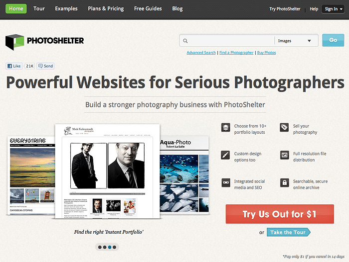
For editorial photographers, looking to archive and sell or license their images, PhotoShelter offers a solution that is hard to pass up.

I caught up with Allen Murabayashi, the company's CEO last week and spoke to him briefly about the state of the photography industry, what we can expect to see out of PhotoShelter in the coming years and why those meaty guide books the company publishes helps to educate photographers about the current marketing trends.

PhotoShelter Home Page

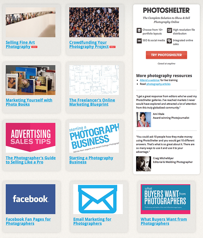
The complimentary guides help you grow your photography business:

PhotoShelter Free Guide Books

PhotoShelter is offering all Tiffinbox readers the following discount when you sign up for PhotoShelter before midnight on October 31st. When your readers sign up at www.photoshelter.com, they can enter the promotion code TIFFINBOX1110. The code entitles readers to the following discounts:

1) Annual Standard Account for $305.00/year – a $55 savings versus a monthly plan.
2) Annual Pro Account $529.00/year – a $70 savings versus a monthly plan

I am told that as of today, all new and existing standard accounts will receive 60 GB of secure storage (it used to be only 35gb), providing all standard accounts a safe space to store thousands of extra files. This increase comes at no additional cost.

Now that you have watched the video, can I ask a favor of you? Post a comment below & tell your friends. You have a variety of options below to spread the word. Thank you!

Filed Under: Business, Photography Tagged With: allen murabayashi, books, editorial photographer, editorial photographers, educational, guide books, Industry, photo, photo industry, photographer, Photography, photography industry, photoshelter, video interview, visual arts

  • « Previous Page
  • 1
  • …
  • 79
  • 80
  • 81
  • 82
  • 83
  • …
  • 164
  • Next Page »

Subscribe To Tiffibox Treats!

Looking for a well-curated email newsletter that will leave you inspired and motivated about your photography business? Sign up below!

About Seshu

Seshu creates relaxed portraits of families and high school seniors in Avon, Connecticut. He also leads a successful headshot photography studio in Connecticut, helping professionals from a variety of disciplines project the very best versions of themselves. He created Tiffinbox as a way of inspiring photographers, to create better images and successful businesses. [Read More]

Email Templates For Headshot Photographers

Email Templates for Headshot Photographers

Recent Posts

  • How Capture One Changed My Event Photography
  • 10 Steps To Stay Positive In Times Of Great Stress
  • Why You Need To Read “Personal Branding For Photographers” Now
  • How To Master Your Website Content Step By Step?
  • Tony Taafe’s TNT Method For Headshot Photographers

Recent Comments

  • Stephen Davison on Are You A Business Owner Who Is Smart, But Stuck?
  • Ben A. on Don Giannatti Clinches The 8th Annual Tiffinbox Award
  • Dan on Don Giannatti Clinches The 8th Annual Tiffinbox Award
  • Donald Giannatti on Don Giannatti Clinches The 8th Annual Tiffinbox Award
  • Stephen Davison on G.E. Masana’s 6 Strategies For Wedding Photography Success
  • Naveen Kumar on Weddings In India Are More Than Being At The Right Place And At The Right Time
  • kartick on Weddings In India Are More Than Being At The Right Place And At The Right Time
  • Leonid Farbman on 6 Uncommon Trends To Grow Your Photography Business
  • Willow and Finch Wedding Photography on 11 Reception Tips To Help Your Wedding Photography
  • Web Designer Malaysia on How To Optimize Your Squarespace Website For Search Engines
  • Creastan on An Interview With Photojournalist G.M.B. Akash
  • Cindy Brown | Atlanta on An Open Letter To A Local Photographer

Become a Patron!

Copyright © 2026 · Tiffinbox · Site Design by Heather Mackan Creative · Built on Genesis